| Enduring Understanding | Learning Objective | Essential Knowledge |
|---|---|---|
VAR-1 | VAR-1.D |
|
Exploring Two-Variable Data
AP Statistics · Topic 2
2.1
Are Two Variables Related?
Syllabus
Source: College Board AP Course and Exam Description
Two-variable data let us ask whether two characteristics are associated 关联 – whether knowing one tells you something about the other. An explanatory variable 解释变量 (the "input") may help predict a response variable 响应变量 (the "output"). Association is not the same as causation.
Vocabulary
Train
| English | Chinese | Pinyin |
|---|---|---|
| associated | 关联 | guān lián |
| explanatory variable | 解释变量 | jiě shì biàn liàng |
| response variable | 响应变量 | xiǎng yìng biàn liàng |
2.2
Two Categorical Variables
Syllabus
| Enduring Understanding | Learning Objective | Essential Knowledge |
|---|---|---|
UNC-1 | UNC-1.P |
|
Source: College Board AP Course and Exam Description
A two-way table 双向表 (contingency table) counts individuals by two categorical variables at once. A marginal distribution 边缘分布 is a row or column total written as a fraction of the grand total (the totals themselves are just counts). Comparing the inside cells shows whether the variables are related.
Vocabulary
Train
| English | Chinese | Pinyin |
|---|---|---|
| two-way table | 双向表 | shuāng xiàng biǎo |
| marginal distributions | 边缘分布 | biān yuán fēn bù |
2.3
Comparing Groups with Conditional Distributions
Syllabus
| Enduring Understanding | Learning Objective | Essential Knowledge |
|---|---|---|
UNC-1 | UNC-1.Q |
|
UNC-1.R |
|
Source: College Board AP Course and Exam Description
A conditional distribution 条件分布 is the distribution of one variable within a fixed category of the other (found by dividing each cell by its row or column total). If the conditional distributions differ across groups, the two variables are associated; if they are the same, there is no association. Segmented bar charts 分段条形图 or mosaic plots display them.
Vocabulary
Train
| English | Chinese | Pinyin |
|---|---|---|
| conditional distribution | 条件分布 | tiáo jiàn fēn bù |
| Segmented bar charts | 分段条形图 | fēn duàn tiáo xíng tú |
2.4
Scatterplots for Two Quantitative Variables
Syllabus
| Enduring Understanding | Learning Objective | Essential Knowledge |
|---|---|---|
UNC-1 | UNC-1.S |
|
DAT-1 | DAT-1.A |
|
Source: College Board AP Course and Exam Description
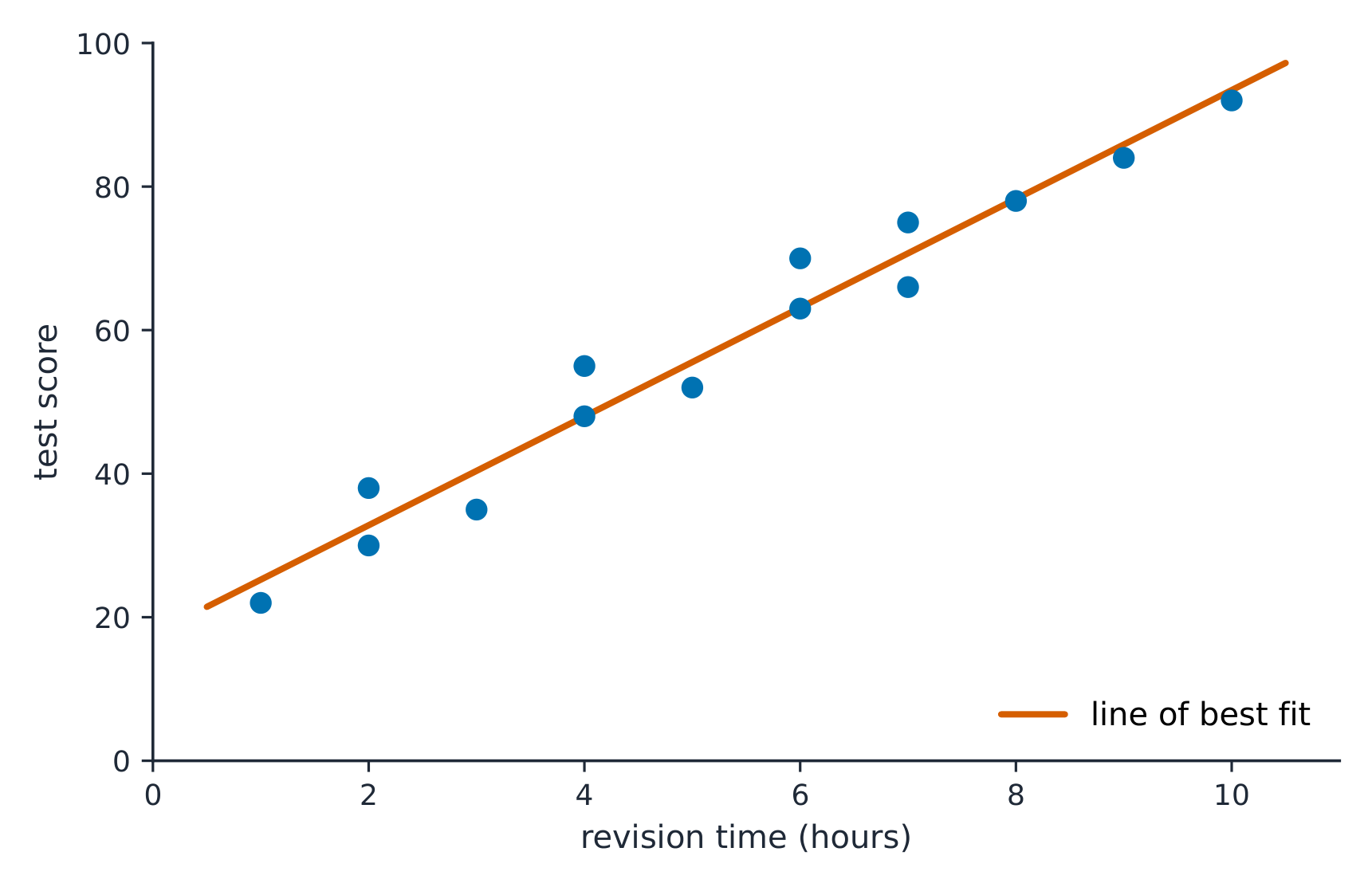
A scatterplot 散点图 plots each individual as a point, explanatory variable on the $x$-axis and response on the $y$-axis. Describe it with DUFS: Direction (positive/negative), Unusual features (outliers, clusters), Form (linear or curved), and Strength (how tightly the points follow the pattern) – always in context.
Vocabulary
Train
| English | Chinese | Pinyin |
|---|---|---|
| scatterplot | 散点图 | sàn diǎn tú |
2.5
Correlation

Syllabus
| Enduring Understanding | Learning Objective | Essential Knowledge |
|---|---|---|
DAT-1 | DAT-1.B |
|
DAT-1.C |
|
Source: College Board AP Course and Exam Description
The correlation coefficient 相关系数 $r$ measures the strength and direction of a linear relationship. It runs from $-1$ to $1$: near $\pm 1$ is strong linear, near $0$ is weak linear. $r$ has no units and does not change if you swap the variables. Warnings: $r$ only measures linear strength, it is not resistant to outliers, and a strong $r$ does not prove causation.
Explore
Strength of a linear relationship
Correlation $r$ runs from $-1$ to $1$: near $\pm1$ the points hug a line, near 0 they scatter. Change it and watch the cloud tighten or spread.
Vocabulary
Train
| English | Chinese | Pinyin |
|---|---|---|
| correlation coefficient | 相关系数 | xiāng guān xì shù |
2.6
Linear Regression Models
Syllabus
| Enduring Understanding | Learning Objective | Essential Knowledge |
|---|---|---|
DAT-1 | DAT-1.D |
|
Source: College Board AP Course and Exam Description
The least-squares regression line 最小二乘回归线 predicts the response: $\hat{y}=a+bx$, where $\hat{y}$ is the predicted response. The slope 斜率 $b$ is the predicted change in $y$ per one-unit increase in $x$; the $y$-intercept 截距 $a$ is the predicted $y$ when $x=0$. Interpret both in context and with units – a graded skill. Avoid extrapolation 外推 (predicting far outside the data).
Worked example. A study of hours studied ($x$) and test score ($y$) gives $\hat{y}=20+3x$. The slope means each extra hour of study is associated with a predicted $3$-point increase. A student who studies $5$ hours is predicted to score $\hat{y}=20+3(5)=35$.
Explore
Fit a least-squares line
A regression line is the best straight-line fit, minimising the squared vertical distances. Its slope predicts how $y$ changes per unit of $x$.
Vocabulary
Train
| English | Chinese | Pinyin |
|---|---|---|
| least-squares regression line | 最小二乘回归线 | zuì xiǎo èr chéng huí guī xiàn |
| slope | 斜率 | xié lǜ |
| y-intercept | 截距 | jié jù |
| extrapolation | 外推 | wài tuī |
2.7
Residuals

Syllabus
| Enduring Understanding | Learning Objective | Essential Knowledge |
|---|---|---|
DAT-1 | DAT-1.E |
|
DAT-1.F |
|
Source: College Board AP Course and Exam Description
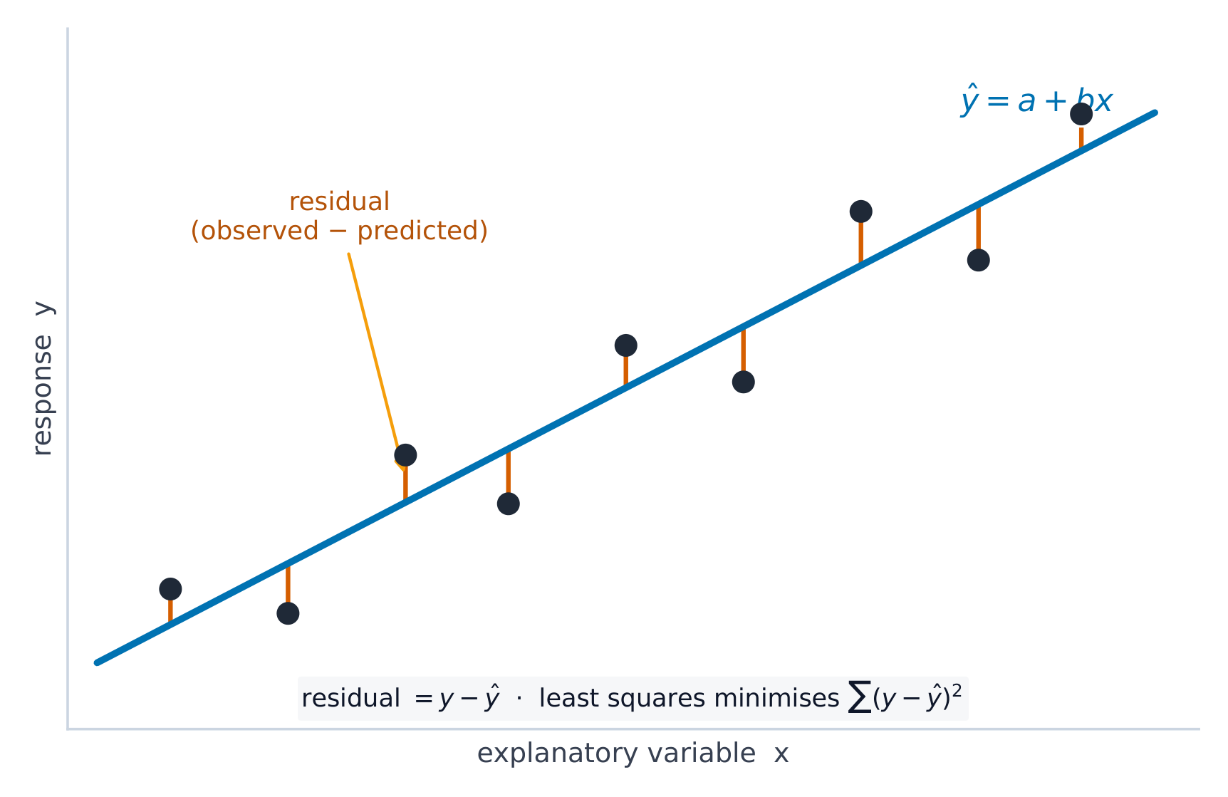
A residual 残差 is actual minus predicted, $y-\hat{y}$: how far a point sits above (+) or below (−) the line. A residual plot 残差图 graphs residuals against $x$. If it shows no pattern (random scatter), a linear model is appropriate; a curved or fanning pattern means the linear model is a poor fit.
Worked example. Continuing the study above, a student who studied $5$ hours actually scored $40$. The residual is $y-\hat{y}=40-35=+5$: the line under-predicted by $5$ points, so this point sits above the line.
Vocabulary
Train
| English | Chinese | Pinyin |
|---|---|---|
| residual | 残差 | cán chà |
| residual plot | 残差图 | cán chà tú |
2.8
Least-Squares Regression and Its Fit
Syllabus
| Enduring Understanding | Learning Objective | Essential Knowledge |
|---|---|---|
DAT-1 | DAT-1.G |
|
DAT-1.H |
|
Source: College Board AP Course and Exam Description
The line minimizes the sum of squared residuals. Its fit is measured by:
- $s$, the standard deviation of the residuals – the typical prediction error, in the response's units.
- $r^2$, the coefficient of determination 决定系数 – the proportion of the variation in $y$ that the linear model explains (a value between $0$ and $1$; multiply by $100$ to state it as a percent). Report it in context: "$r^2 = 0.81$ means 81% of the variation in $y$ is explained by the linear relationship with $x$."
Vocabulary
Train
| English | Chinese | Pinyin |
|---|---|---|
| coefficient of determination | 决定系数 | jué dìng xì shù |
2.9
Departures from Linearity
Syllabus
| Enduring Understanding | Learning Objective | Essential Knowledge |
|---|---|---|
DAT-1 | DAT-1.I |
|
DAT-1.J |
|
Source: College Board AP Course and Exam Description
Some points strongly affect the line. A high-leverage 高杠杆 point has an extreme $x$-value; an influential 有影响的 point noticeably changes the slope or $r$ when removed; an outlier here is a point with a large residual. When the pattern is curved, transform a variable (e.g. take a log) to straighten it, then fit a line to the transformed data.
Vocabulary
Train
| English | Chinese | Pinyin |
|---|---|---|
| high-leverage | 高杠杆 | gāo gàng gǎn |
| influential | 有影响的 | yǒu yǐng xiǎng de |
2.9
Exam tips
- On a scatterplot describe direction, form, strength, and outliers; $r$ ranges $-1$ to $1$.
- Correlation is not causation — a lurking variable can drive both.
- Interpret the slope of the least-squares line in context ("per one unit of $x$, predicted $y$ changes by $b$").
- Check a residual plot: no pattern means a line fits; a curve means it does not. Avoid extrapolation.
- $r^2$ is the fraction of variation in $y$ explained by the model.